


Introduction: Why This Matters More Than Ever
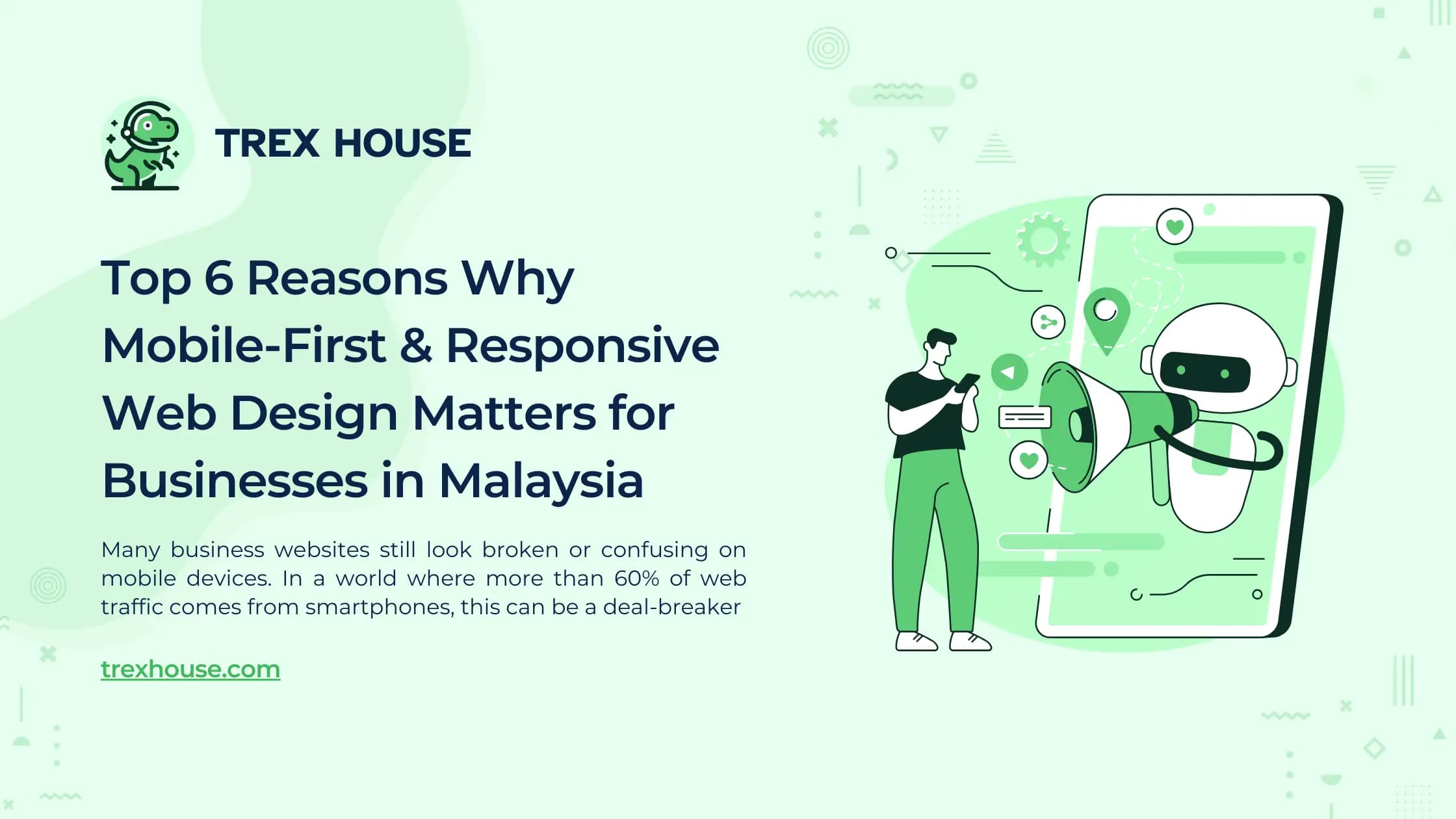
If you’re running a business in Kuala Lumpur or anywhere in Malaysia, your website is often the first touchpoint between you and your customers. But here’s the painful truth: many business websites still look broken or confusing on mobile devices. In a world where more than 60% of web traffic comes from smartphones, this can be a deal-breaker.
Customers are frustrated when they have to pinch and zoom just to read your content. They leave your site if it takes too long to load or if buttons are too small to tap. These issues are especially common among SMEs and startups with limited web development resources.
Fortunately, two modern web design strategies can solve this problem: mobile-first design and responsive web design. Let’s break down why they matter — and how they can help your business grow.
1. Mobile-First Design Prioritizes Your Most Valuable Audience
Designing for mobile first means you build your website starting from the smallest screen, then scale up. This forces a focus on the essentials.
"Mobile devices now account for nearly 63% of global web traffic." – DataReportal 2024
This is especially relevant in Malaysia where mobile usage is even higher among younger audiences and the urban population.
How TREX House Can Help
At TREX House, we start every project with mobile screens in mind. We ensure your site is fast, functional, and user-friendly from the very first tap.
2. Responsive Web Design Ensures Your Website Works on All Devices
Responsive design means your website layout automatically adapts to the screen size — whether it’s a smartphone, tablet, laptop, or desktop.
"Walmart Canada saw a 98% increase in mobile orders after adopting responsive design." – SingleGrain Case Study
If a major corporation sees that kind of result, imagine what it can do for an SME or startup trying to grow.
How TREX House Can Help
We build responsive websites that look and perform beautifully on any device — without needing separate versions or extra maintenance.
3. Better User Experience = Lower Bounce Rate
When a site is designed with mobile-first and responsive principles, users are more likely to stay, explore, and engage. Bad mobile experiences are one of the top reasons users leave a website.
"61% of users won’t return to a site if it’s hard to access on mobile." – Think with Google
How TREX House Can Help
We focus on intuitive layouts, readable fonts, and tappable buttons to keep your visitors happy and engaged.
4. Faster Loading Speeds Keep Users (and Google) Happy
Mobile-first sites are typically optimized for speed — fewer heavy images, cleaner code, and smart loading strategies.
"For every 1-second delay in mobile load time, conversions can drop by 20%." – Google
How TREX House Can Help
We implement performance-first design techniques to ensure your site loads fast and passes Google's Core Web Vitals.
5. Boosts Your Search Engine Ranking (SEO)
Google now uses mobile-first indexing. If your site isn’t mobile-friendly, it might not even show up in search results — especially for mobile users.
"Google prioritizes the mobile version of content for indexing and ranking." – Ahrefs Blog
How TREX House Can Help
Our websites are SEO-optimized from the ground up, making sure you stay visible and competitive on search engines.
6. Increases Conversions and Revenue
More than half of e-commerce traffic in Malaysia happens on mobile. If your checkout or inquiry form doesn’t work on mobile, you’re losing sales.
"A local SME saw a 30% increase in conversions after switching to a responsive site." – Grand Marketing Solutions
How TREX House Can Help
We design goal-oriented interfaces that convert visitors into customers — whether it's for product purchases or service inquiries.
Conclusion: A Smart Investment That Pays Off
Each of the six points above tackles a real-world pain point. Together, they highlight how mobile-first and responsive design is no longer a nice-to-have — it’s a must-have. By focusing on user experience, performance, and accessibility, you increase leads, improve your search rankings, and create a strong digital foundation for your business.
TREX House is a professional web design and development agency based in Malaysia. We specialize in helping SMEs, startups, and corporate businesses create high-performing, mobile-optimized websites that look stunning and convert visitors into customers.